Ballot Bud
Making voting easy, empowering, and stress-free for young and first-time voters
Timeline
July - September 2025
Team
1 PM, 2 UX Designers, 1 UXR

TL;DR
Over 10 weeks, I worked as the UX Researcher on BallotBud, a mobile voting platform designed to help young and first-time voters feel informed and confident. I led user research through surveys and interviews, synthesized insights into key opportunity areas, and collaborated with designers to translate findings into intuitive, user-centered features. The result was a high-fidelity prototype that simplifies ballots, clarifies propositions, and empowers voters to participate in every election.

Overview of my design process for this project
Background
Every election, millions of young people register to vote for the first time, and a surprising number never make it to the ballot box. Not because they don't care, but because the process itself gets in the way: confusing deadlines, jargon-filled propositions, and a flood of biased or outdated information.
Our team wanted to understand why civic intent so often stalls before it becomes civic action — and whether design could close that gap.
The problem
Voting isn't as simple as it seems…
While young people make up a large portion of the electorate, many still struggle with the voting process, turning what should be empowering into something overwhelming. Confusing deadlines, jargon-filled propositions, and the lack of clear, unbiased information often leave first-time voters feeling uncertain or disengaged, especially in local and state elections.
How might we provide clear, nonpartisan, and personalized voting information that helps young and first-time voters feel informed, confident, and motivated to participate in every election?
solution
Introducing BallotBud
To address these challenges, our team designed BallotBud; a mobile voting companion built to simplify the voting experience for young and first-time voters.
BallotBud brings everything a voter needs into one place from registration and ballot previews to candidate comparisons and deadline reminders.
Our goal was simple: make civic participation approachable, trustworthy, and empowering, transforming what often feels like a complicated process into a guided, confidence-building experience.

Sneak peek into our solution!
user interviews
Learning about the voter experience
Before jumping into solutions, we needed to deeply understand the why behind young voters’ struggles. What exactly makes voting so confusing? What tools are they currently using, and why aren’t those tools helping them feel prepared?
User Survey
We surveyed 55 people ranging from ages 18-65:
80% based in California
76.4% young voters between 18-24 (voting for the first time)
User Interviews
We interviewed 5 people ages 18-24:
Based in California
Young and first time voters
Insights
4/5
interviewees struggled to understand political jargon and ballot language
4/5
interviewees primarily got information from social media outlets (e.g. Instagram, TikTok)
3/5
interviewees voted and paid more attention to federal elections
Transforming feedback into insights
To make sense of the survey data, I reviewed and analyzed all survey responses using qualitative coding; applying color-coded tags to identify recurring themes, patterns, and clusters, which informed our key user insights and design priorities.
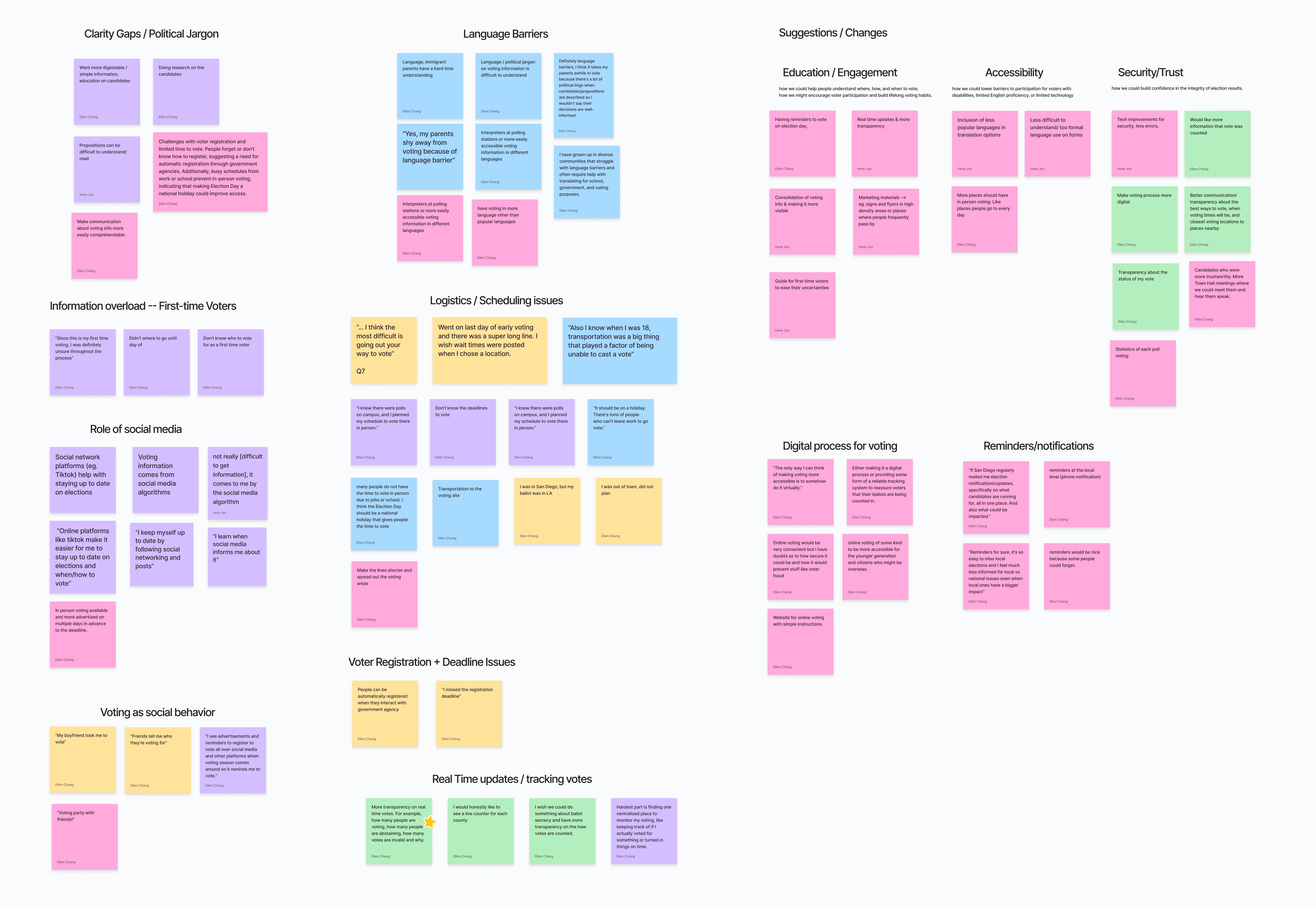
Affinity Mapping of survey responses
After synthesizing our findings through an affinity mapping session, several core themes emerged:
Clarity: Voters wanted plain-language explanations of propositions and candidate stances
Trust: Many questioned the credibility of the resources they used
Guidance: They needed help organizing tasks and creating a personalized voting plan
Accessibility: They wanted a quick, mobile-first experience that fits their busy lives
We found 3 main pain points:
Lack of voting education
Young voters don’t fully understand the voting process, ballot structure, or the role of local/state elections
Lack of organized, unbiased information
Existing resources feel overwhelming, cluttered, or biased, making it difficult for voters to trust and interpret information
Low local/state engagement
Voter turnout is consistently lower in local and state elections, partly due to lack of awareness about impact and limited resources
With these pain points in mind, our next step was to translate our research findings into tangible ideas and user flows; bridging the gap between what we learned and what we could build.
Our user research became the foundation for our design direction. We brainstormed various features for each pain point and asked ourselves:
ideation
From research to design
If these are the barriers, what features could directly address them?

Features brainstorming on Figjam!
Lack of voting education
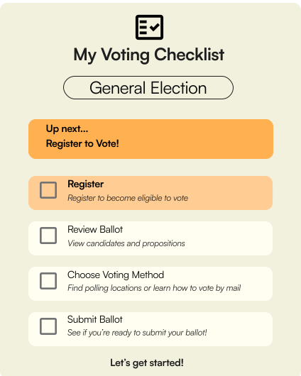
→ We designed a Voting Plan Checklist that breaks down the process step by step (registration, deadlines, polling place)
Lack of unbiased information
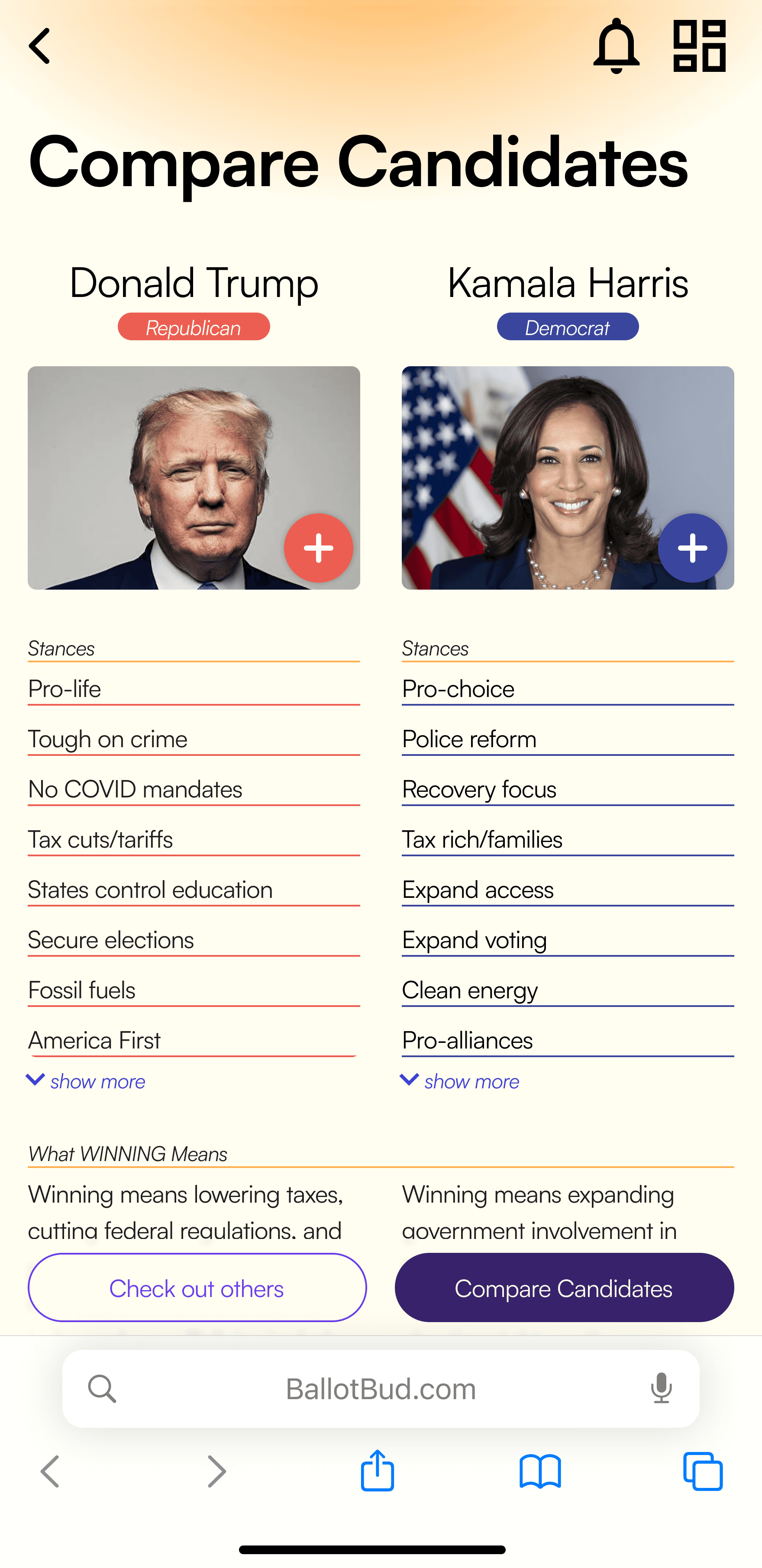
→ We created side-by-side candidate comparisons and simplified proposition explainers written in plain language
Low local/state engagement
→ We prioritized personalized ballot previews so users see all of their elections (not just federal) and get reminders about upcoming local races
This mapping allowed us to tie every design decision back to user pain points.
Design process
Turning insights into ideas
With research insights and a clear direction, we moved into ideation; the part where our findings began to take shape as real, tangible experiences. Starting off with exploration and rough sketches of potential features!
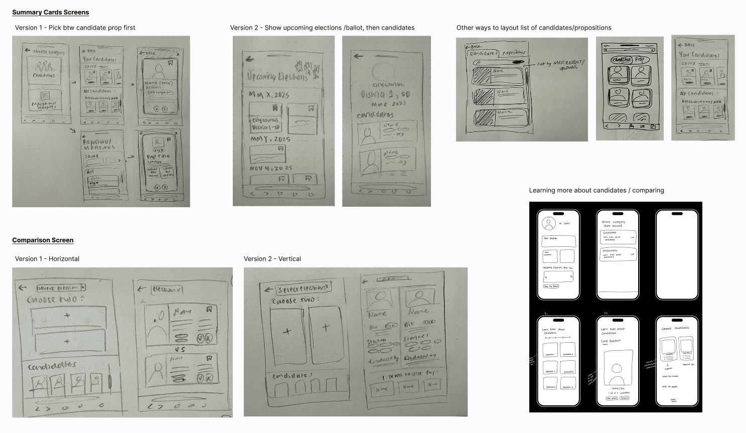
Different screen and flow explorations helped us test what features to include :)
Our goal was simple: design a product that makes voting feel less like a chore and more like an act of empowerment.
Our sketches evolved into low and mid-fidelity screens, giving us a clearer picture of how volunteers would move through the platform while leaving room for quick iteration.

Iterations, Design Decisions, Usability Testing!
But does our solution work?
Together with my teammates, I helped design and facilitate usability testing sessions with young and first-time voters to observe how they interacted with the prototype. We wanted to see if users could easily navigate the app, find key information, and ultimately feel more confident about voting.
What we found was encouraging, but also eye-opening.
What users loved
Participants appreciated having all voting information in one place.
The ballot education page stood out as particularly helpful, with its clear “What YES means” and “What NO means” breakdowns making complex propositions easier to understand.
But where users struggled…
ITERATION
Siloed navigation
4 out of 5 users struggled to find polling location information when completing a task. Users navigated back and forth between multiple pages, unsure where to locate this key detail.
3 users could not tell the active state of "Yes/No" toggle buttons. So, we iterated to a checklist instead.

Good afternoon!
1:47

04 Nov
View election calendar
Nearby
Polling locations
Learn more about candidates and propositions
Ballot Education
More entry points
ITERATION
Buried Candidate Comparison Tool
4 out of 5 users overlooked the Compare Candidates feature because it was placed at the bottom of the candidate list page and lacked visibility. This feature was critical for helping users make informed decisions, yet its discoverability was poor.


Bottom of the screen
Sticky element, increased visibility
ITERATION
Misleading Color Usage
Red and green were misinterpreted as political affiliations or approval signals. This also created accessibility issues for users with color vision deficiencies and risked misrepresenting neutrality; a key design principle for a nonpartisan platform.

Neutral indicators

Red/Green indicators
FINAL designs
Bringing BallotBud to life!
After iterations, our final design delivers a clear and approachable voting experience. The high-fidelity prototype brings together everything we learned, prioritizing clarity, accessibility, and confidence for first-time voters.
Ballot Education & Candidate Comparison
Learn what’s on your ballot — all in one place.
Explore candidates/propositions through clear, nonpartisan summaries. Users can understand each item on the ballot and even compare candidates side-by-side, turning confusion into confidence before voting.


Guided Voting Checklist
Your step-by-step guide to voting made simple.
From registration to reviewing your ballot, BallotBud provides all the tools and resources needed to complete every step of the voting process — making it approachable and easy to follow for first-time voters.
Find Polling Locations & Voting Methods
Know where and how to cast your vote.
Whether voting by mail, drop box, or in person, users can search for nearby polling locations by county and learn about different voting methods.

learnings & impact
This experience sharpened my research and design instincts!