American Red Cross
Streamlining volunteer navigation, hour management, and event organization.
Timeline
Jan - Mar 2025
Role
UX Researcher
Team
2 UX Designers, 2 UX Researchers
TL;DR
As part of a product design course, I collaborated with American Red Cross coordinators to reimagine the Volunteer Connections platform. Our goal was to streamline volunteer engagement, hours management, and event organization. The process included user research, journey mapping, and multiple design iterations tested for usability. At the end, our final prototype was presented to American Red Cross coordinators and received positive feedback on how it simplified navigation and improved information visibility for volunteers.

Overview of my design process for this project
Background
The American Red Cross (ARC) is a non-profit organization that provides emergency assistance, disaster relief, and disaster preparedness education and is part of the global Red Cross and Red Crescent movement.
Within American Red Cross is a volunteer connections portal that facilitates tasks essential to volunteering, including organizing events, managing volunteer hours, and fostering collaboration across different Red Cross chapters, clubs, and committees.
The Problem
Volunteer Connection was designed to be a self-service tool for volunteers, yet in practice it often fell short.
ARC volunteers rely on the online portal to log hours, track service, and engage in opportunities like blood donations. Key features such as tracking progress, logging diverse activities, and finding event information were difficult to navigate, leaving volunteers frustrated and disengaged. Without a streamlined way to see their impact or manage their commitments, the portal wasn’t fully supporting the volunteer journey.
To guide our design process:
How might we create a unified portal that simplifies tracking, highlights impact, and supports volunteers every step of their journey?
The Solution
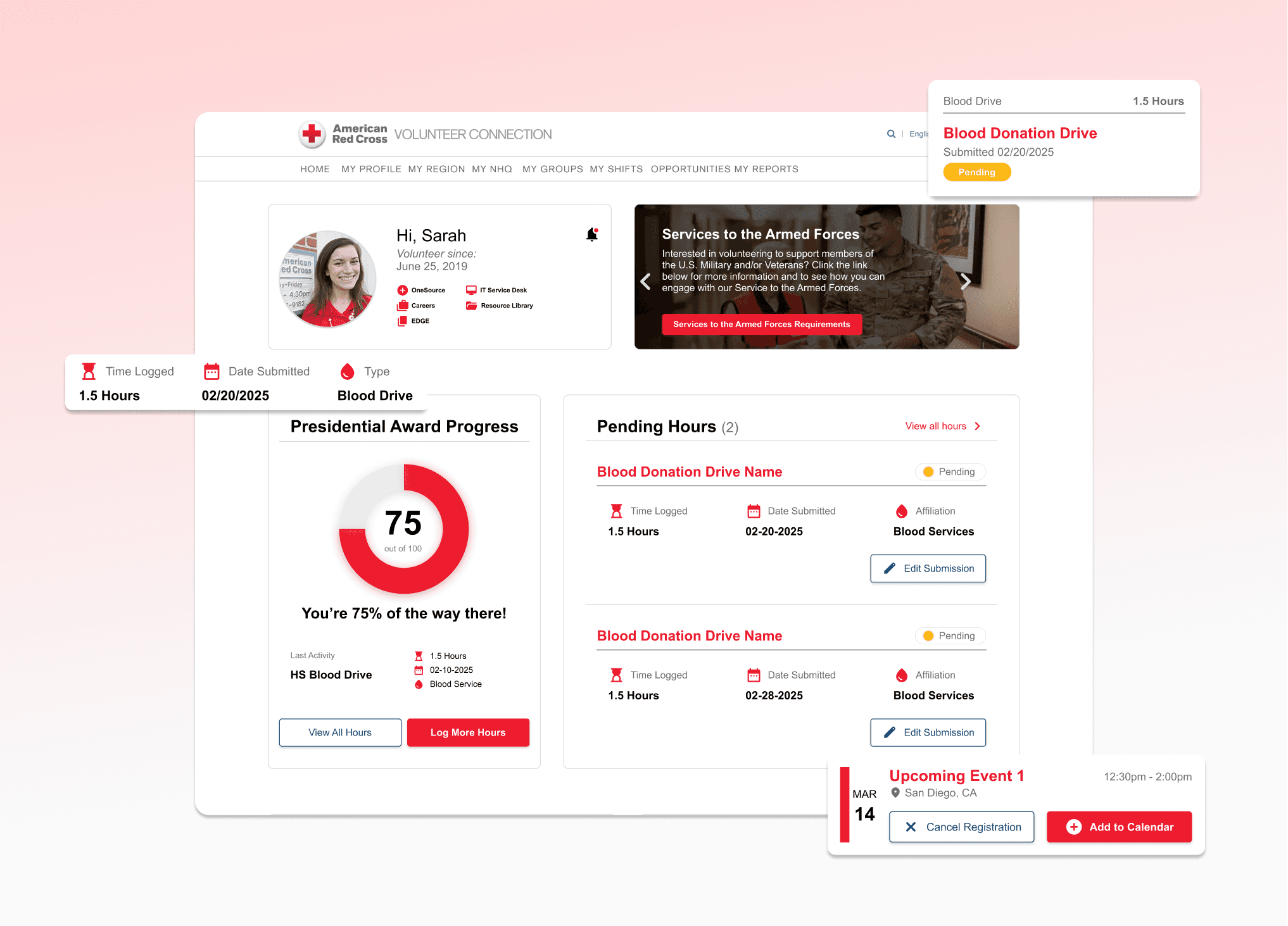
Volunteers are able to track their progress through a clearer dashboard, making it easier to see hours and upcoming commitments at a glance. As well, navigation is streamlined so that tools are easier to discover, and opportunities are tailored to each volunteer’s committee or department to increase engagement and relevance.

Sneak peek into our solution!
User Interviews
Research & Discovery
I conducted interviews with 2 ARC staff coordinators and 5 existing volunteers for about 30 minutes each and we were able to uncover a more holistic understanding of the back-end, especially when it came to the process for volunteer hour approvals and volunteer event postings.
What we heard from users
7 User Interviews
Insight 01
No progress visibility + impact
Whether it was hours, certifications, blood donations, or milestones, volunteers had no clear way to track their progress. Without visibility into pending or approved hours, service award milestones, or donation history, many felt disconnected from the impact they were making.
Insight 02
Volunteers struggled with simple tasks like hour management
Key tasks like logging hours were confusing and time-consuming, volunteers had to guess when logging hours because open text fields and unclear terms like “on-call” vs. “worked” left them unsure what to enter.
Insight 03
Volunteers need tools in one centralized hub
Essential tools like blood donation forms and maps to find local centers were separated across different Red Cross platforms, forcing volunteers to constantly switch back and forth instead of accessing everything in one place.
Transforming feedback into insights
With all the raw feedback gathered during research, I synthesized observations into clear patterns and opportunities. This process helped us move from scattered pain points to actionable insights that directly shaped our design decisions.

Evolution of ideas on stickies
Designing the main user flows
Before creating wireframes, I mapped out the end-to-end experience for two key flows:
Entering Hours and Blood Donations Hub

ideation & design
Turning insights into ideas
Before jumping into high-fidelity designs, I sketched out early ideas to bring our user flows to life. These quick explorations let us imagine how volunteers and donors might move through the portal, uncovering opportunities to simplify navigation and create a more seamless experience.

Different screen and flow explorations helped us test new ways to simplify key volunteer tasks :)
Lo-fis in Figma
Our goal was simple: design a product that makes voting feel less like a chore and more like an act of empowerment.
Our sketches evolved into low and mid-fidelity screens, giving us a clearer picture of how volunteers would move through the platform while leaving room for quick iteration.
Hours flow
Volunteers can log new hours, view pending and approved entries, and see their overall progress toward milestones.

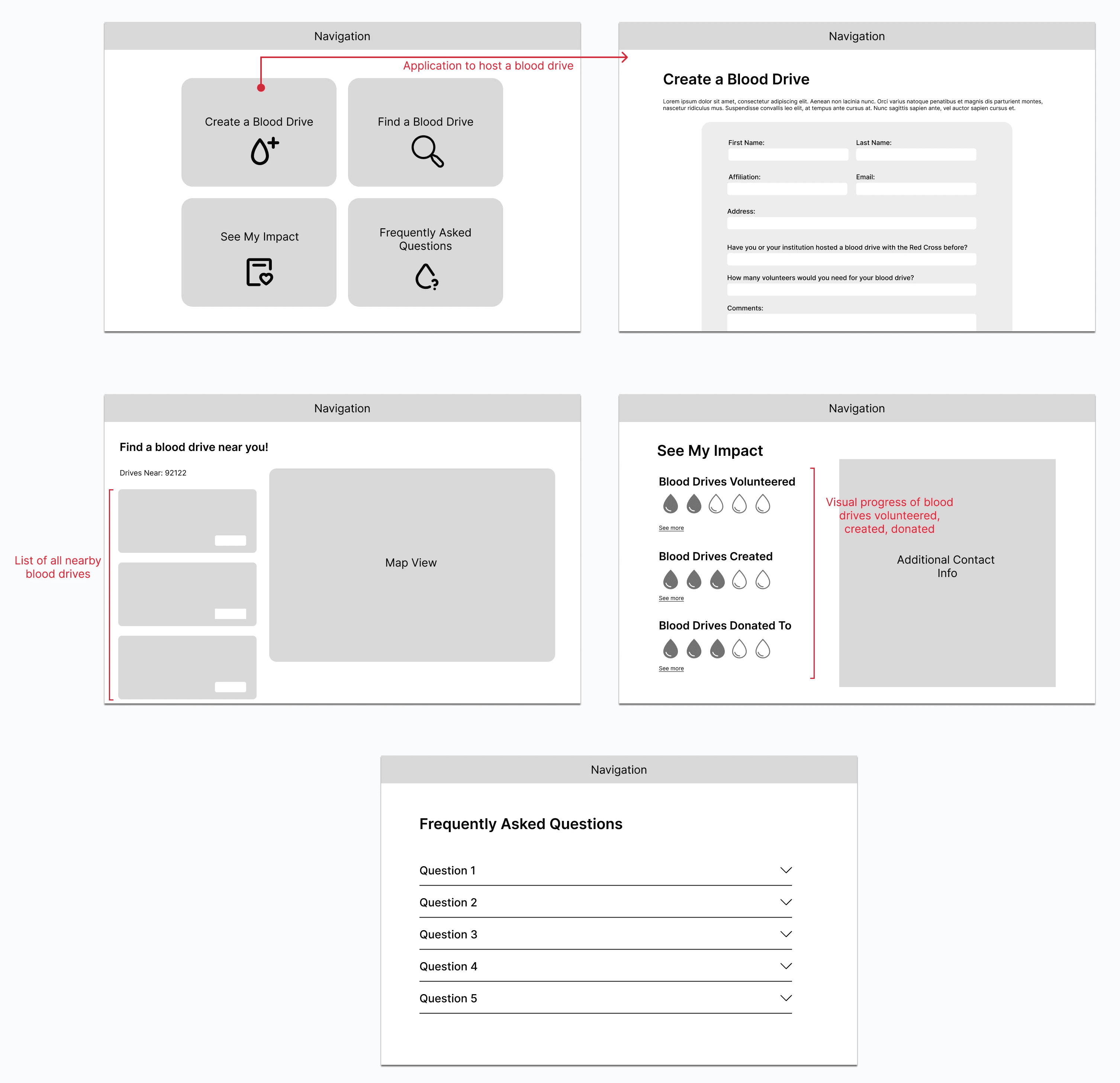
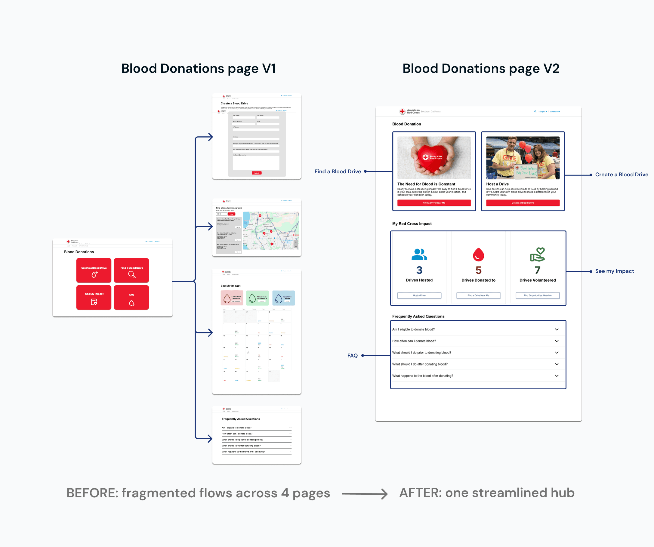
Blood donations flow
A new section that helps volunteers find donation centers, see their impact, and organize blood drives
Iterations, Design Decisions, Usability Testing!
When we tested our initial redesigns with users, we quickly realized that some of our ideas still fell short of volunteer needs.
ITERATION
Siloed navigation
4 out of 5 participants struggled to find polling location information when completing a task. Users navigated back and forth between multiple pages, unsure where to locate this key detail.
3 users could not tell the active state of "Yes/No" toggle buttons. So, we iterated to a checklist instead.

71% users preferred V2 that added clear status indicators, visual progress tracker, and an organized view that groups hours by committee.
ITERATION
Buried Candidate Comparison Tool
4 out of 5 users overlooked the Compare Candidates feature because it was placed at the bottom of the candidate list page and lacked visibility. This feature was critical for helping users make informed decisions, yet its discoverability was poor.
ITERATION
Misleading Color Usage
Red and green were misinterpreted as political affiliations or approval signals. This also created accessibility issues for users with color vision deficiencies and risked misrepresenting neutrality; a key design principle for a nonpartisan platform.

User feedback informed the progress tracker was the most valuable feature, so we placed it at the very top to maximize discoverability. We also added an “Upcoming Events” section with clear calls-to-action, allowing volunteers to easily add events to their calendars or manage their registrations.
These changes transformed the dashboard into a more actionable hub, giving volunteers quick access to what matters most.
High-fidelity designs!
FINAL SOLUTION
Log hours with simple, structured input
Before, students didn’t know what to enter — open fields and vague terms led to guesswork.
Now, the page uses guided steps and dropdowns, so students see exactly what’s needed and can log their hours quickly without confusion.

Find nearby blood drives with location-based search
Before, volunteers had to jump between different Red Cross pages to look for drives, which made the process confusing and time-consuming.
Now, the search is built right into the Volunteer Connections portal. Users can enter their ZIP code and instantly see nearby drives.

Start your own
blood drives
Volunteers can now access the hosting form directly within the Volunteer Connections portal, making it simple to set up and manage their own blood drives without leaving the site.
Reflecting back on the process, what did I learn?